Why do all successful Amazon entrepreneurs unanimously say that attractive photos are perhaps the most important factor in their success? Because it’s true.
The task of the photo is NOT just to demonstrate the product. It’s to reveal its best aspects, features and characteristics. Convince the buyer that it is the perfect choice, close objections and encourage them to open their wallet. “Delicious” photos evoke emotions, provoke impulsive purchases (and therefore increase sales).
How to achieve all this, read below.
It goes without saying that the images should be clear, informative and free of highlights. The product should occupy at least 85% of the frame.
For the most accurate colour reproduction, it is best to use RGB mode. CMYK is also allowed, but some details may appear faint on computer screens (CMYK is more suitable for printing).
The best file formats to upload are .jpeg and .jpg. You can also use TIFF, PNG, and GIF. Animated formats such as .gifs are not supported.
The best combination: 6 photos + 1 video.
The perfect combination: 5 photos + 1 video + 1 3D mock-up
As for the size, all the guides advise you not to upload images with sides smaller than 1600 pixels. The reason for this is that the platform does not impose the Zoom function on smaller sizes.
Rectangular images are not prohibited, but are discouraged as they look cropped.


You might ask: “But how can I take selling photos if the platform puts sellers in such tight corners?”. The answer is that these requirements apply only to the first (i.e. main) image. Then we switch on the “creativity” mode and start creating.
We need all the following pictures in the listing to reveal the product (its advantages, characteristics and benefits), to evoke emotions and desires. To do this, use the tricks we have collected for you.


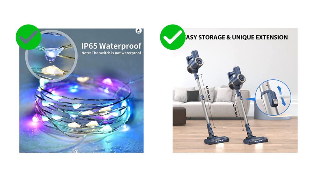
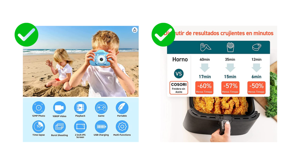
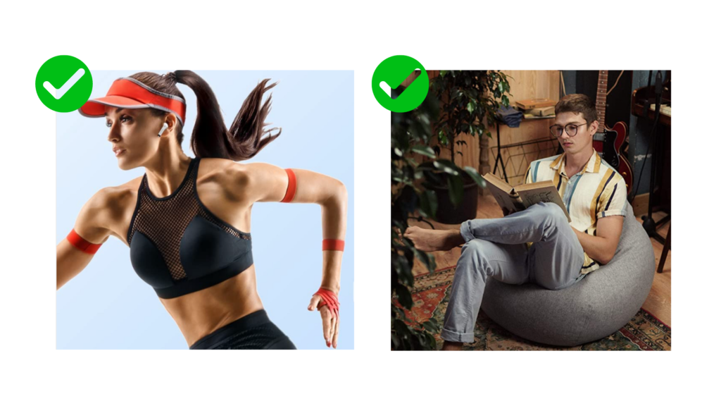
Of course, these are just basic tips on how to take great photos. After all, different niches have their own evaluation criteria. In some, it is important to show ease of assembly (furniture) and ease of use (appliances). In others, it is important to create a situational picture (a child’s joy over a new toy). In others, it is important to focus on quality and fit (clothing).
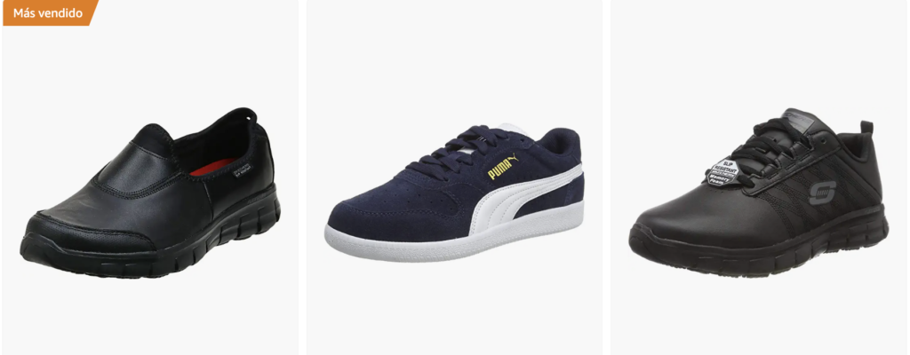
“Explore the Amazon blog to find even more tips. For example, if you sell shoes, you should only show 1 sneaker in the first photo. It should be positioned at a 45° angle and point to the left.
If you don’t have time to search for information and artists, don’t hesitate to contact us. Our team of photographers, retouchers, and designers will create great photos for marketplaces for you, taking into account all the rules of the platform and marketing techniques.